Kanban Maturity and A Technique for Visualizing It
I received a great question from one of my webinar attendees and this question has also received a bunch of attention from the Kanban community since this visualization first surfaced in the summer of 2012 ago at the Kanban Leadership Retreat in Austria.
How do we measure our maturity using the Kanban method?
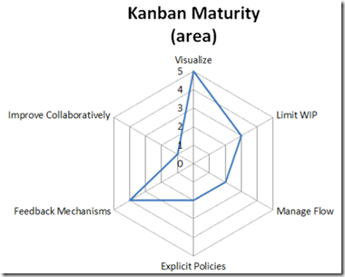
I have used the technique that came out of Mayrhofen at #KLRAT as the basis for how I work with teams to monitor Kanban maturity. There isn’t a “standard” set of questions that the Kanban community uses in the creation of the kiveat chart. In general, it is being suggested that each team/coach comes up with a context-specific way of measuring and ranking maturity within the 6 practice groups that applies to “that team”. That visualization can then be used to monitor the anticipated growth for that team over the course of time. One thing that the Kanban community is cautious about though is “comparisons” between kiveat charts and assessments. Since each assessment is relatively subjective, comparisons should be avoided as it would be hard to compare and may potentially be misleading to the team.
That said, here is how I use the chart.
I have a set of questions I ask per category. On a scale of 1 to 5, 1 being “We do not do that”, 3 being “We do that”, 5 being “We could teach someone to do that”, I look for activities that would allow me to select one of those values for one of my questions. As an example:
Question: Identifying types of work
Observation: Does the team identify different types of work? Do they have User Stories, Bugs, Improvement Tasks, etc. described within their process? If they do not, they would be a 1. If they do, they would be a 3. I’d then look for evidence that they are capable of teaching work item type defining to another team, or that they could do so if required. If they could, they would be a 5.
I go through all of my questions for an axis of the chart and give them these rankings. I then take the average value of all of the answers and that is my data point on the kiveat chart. My visualization category currently has 10 questions in it, so if I get 35 total points/10 questions, I get a 3.5 visualization score on the kiveat chart.
My Limit WIP category currently has 5 questions, so 15 points/5 questions would give me a 3 Limit WIP ranking on the chart.
Following this pattern, I eventually end up with 6 axis on the kiveat chart, all ranked from 1 to 5 and this “coverage” can be used to describe the team’s Kanban maturity from my perspective.
David Anderson, in some of the slides I’ve seen him use and in talking to him, describes a progression of novice to experienced tactics within each category and each of his axis has different scales to represent the increasing maturity on that scale. He does arrive at the same kind of coverage visual and describes that coverage as an indicator of maturity from his perspective. My kiveat chart and David’s would not be comparable though and this is completely OK and encouraged. As I mentioned above, the current thoughts within the Kanban community are to discourage direct comparisons between these kiveat charts.
What kinds of questions would you use to measure you’re companies Kanban maturity?
What Should My WIP Limit Be? Super Easy Method to Find Out!
If you’ve built a kanban system, or you’ve tried to put a WIP (work in progress) limit on a phase in your workflow, you’ve probably asked or been asked this question. And very often, then answer is “I don’t know. How about we try n.” where n is a guess. Usually an educated guess like:
- 2 x the number of developers
- 1.5 x the number of people on the team
- Number of people involved + 1
And these are all ok places to start if you have no data, but with a little data, we can stop guessing and set our WIP limits with some empirical information and at the same time start building a system that will satisfy one of the assumptions required for us to use Little’s Law properly. There are two things that we need to have in order to use this super easy method:
- Data about average time in state for work items
- CFD (cumulative flow diagram)
Ok, I guess we don’t need the CFD if we have the data, but it sure is nice to visualize this information. 😉 We do need to have some data about the way that work passes through our system and we need the data that would be required to create a CFD. For the purposes of this post, lets assume that we are capture the time in state for each work item. Entire time in the system is often called lead time. Time in between any two phases in the system can be cycle time but we’re interested in cycle times for a single state at a time as our objective is to determine the WIP limits for each column in our kanban system.
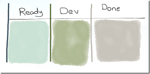
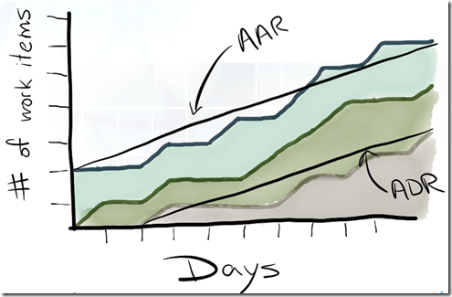
Let’s use a simple approach to measuring average time in state in days. On our simple kanban system above, we have a Ready State, Development state and a Done state. Each day, we count the # of items that have cross a state boundary and put those numbers on our CFD chart. After several weeks, we have enough data to start calculating a couple new metrics from our CFD.
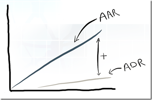
With even just a couple weeks of data that visualizes how work moves through our system, we can now start measuring Average Arrival Rate (AAR) and Average Departure Rate (ADR) between any two states in our system. AAR and ADR are simply represented as the slope of a line. If we calculate the rise (x-axis) over the run (y-axis) values, we get the slope.
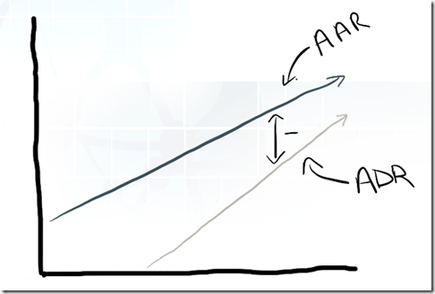
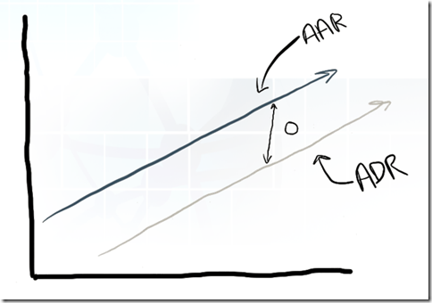
It is the relationship between the two values that is interesting to us and will allow us to more empirically set the WIP Limit values in the system. Based on our understanding of Little’s Law, we are striving for a average rate of divergence between the two of near 0.
A negative divergence suggests the WIP limit is to low and that we are under utilized.
A positive divergence rate suggests the WIP is too high and we are overburdened.
Since ADR (the rate at which we finish work) represents our current capability, the value of ADR should be considered a great candidate for the WIP limit for this state. With the the right WIP limit in place, AAR should match ADR and we will find an average divergence rate of 0. As your team’s capability changes, our divergence will go either positive or negative and will provide an indication of when our WIP limits should change and what they should change to.
And there you have it! When the rate of divergence between AAR and ADR is near zero, we know that our WIP limit is right and that we’re satisfying one of the assumptions required to make Little’s Law work for us!

